
Regular readers will have come to know that The Yorkies are footballing nerds. We once spent 15 minutes during a match attempting to identify a kit (it was Millionaros of Colombia and Toronto was likely losing at this point). And, though it is well understood that kits have nothing to do with the football, they are a major part of footballing culture.
Now that all of kits have been released, let us review some:
Vilified kits:
 3.Toronto FC away. From a distance it’s not a bad kit, but up close, it’s the gross overuse of a maple leaf... someone should explain to me why a city should be using a national symbol. The Whitecaps appear to be using the mountains, Montreal are rocking the fleur de lis. Is TFC that devoid of any original ideas that we have to pretend to be ‘Canada’s Team’? I know they’re not, but that’s the correlation being subtly demonstrated.
 2. Houston away. Why even have a launch for this thing? It’s so ordinary. They could’ve easily had the roll-out for this the second it was finalized back in December. It’s like calling a press release of a new pizza sponsor “news”.
 1. Dallas home. After all this time, being referred to as ‘The Hoops’, the horizontal stripes are gone. I don’t get it. There aren’t enough unique patterns in MLS and removing one is a head scratcher. The kit isn’t terrible, it’s the change.
Favourite kits:
 4. New England home. It’s simple and striking, two things very difficult to do with the Adidas identa-kit templates, but they’ve lost the white trim and went all red. Having a mono-colour sponsor makes this a classic. Now if they can only do something about that dodgy badge...
 3. LA Galaxy home. It’s gorgeous. We would consider getting this kit just because it looks amazing and it is somehow an improvement on the previous home kit, which was also a stunner. The navy/gold trim on the cuffs sold me. I thought this was the best hands down until I saw...
 2. Portland 3rd. It’s simple and has that proper retro feel, right down to the colours. The old gold with the pine green compliment each other well, but the clincher is the sponsor. Clearly that is not Alaska Airlines’ word marking, but they were cool enough to ‘retrofy’ their logo by just converting their wordmark into Arial Black font. If they could’ve somehow implemented the actual old NASL crest, this would be a masterpiece. This was the champion. Then yesterday I see this one...
 1. Sporting KC away. God I hate them so much. They're good, Collin is a pain, Zusi is a pain, and in addition to the worst home kit and name and badge combination going, they've now got the best kit with that same terrible colour scheme. Yes, I understand it makes no sense, but the hoops are stunning. Seriously, I quietly raged and drooled when I saw this one.
Notable kits:
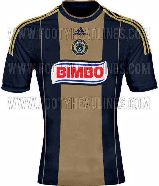
Chicago home is actually quite a nice kit. It took a bit of getting used to that cornflower blue criss-cross pattern beneath the sponsor, but the navy-red top/bottom is nice. Colorado is so close to something special, with that killer 3rd blue kit, then they phone it in with this maroon snoozefest. It doesn’t need a sponsor, just a more vibrant shade or something. My apologies to Philadelphia, but did your home kit actually change? It’s a shame that Chivas is getting rebranded. Their home kits have improved year to year and even without the sponsor, this looks nice. Their Mexican counterparts, however, have nailed it down.


"even without the sponsor, this looks nice".
ReplyDeletelike a sponsor would make it better? booooooo. the no sponsor's the best bit about that shirt.
I THINK there are very faitn horizontal hoops on the Dallas one. Also I can't STAND the vertical placement of the stars above the crest on the SKC kit
ReplyDelete